Brand Identity Design

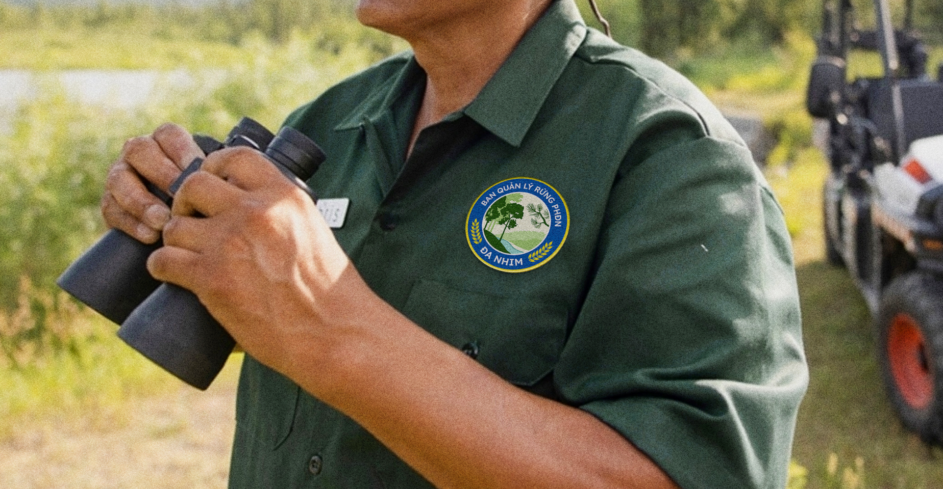
Through a collaborative effort with RIO, these hidden gems are being unveiled. By crafting distinct identities for Vietnam's conservation areas, we empower forest rangers and government agencies to manage protection and preservation.
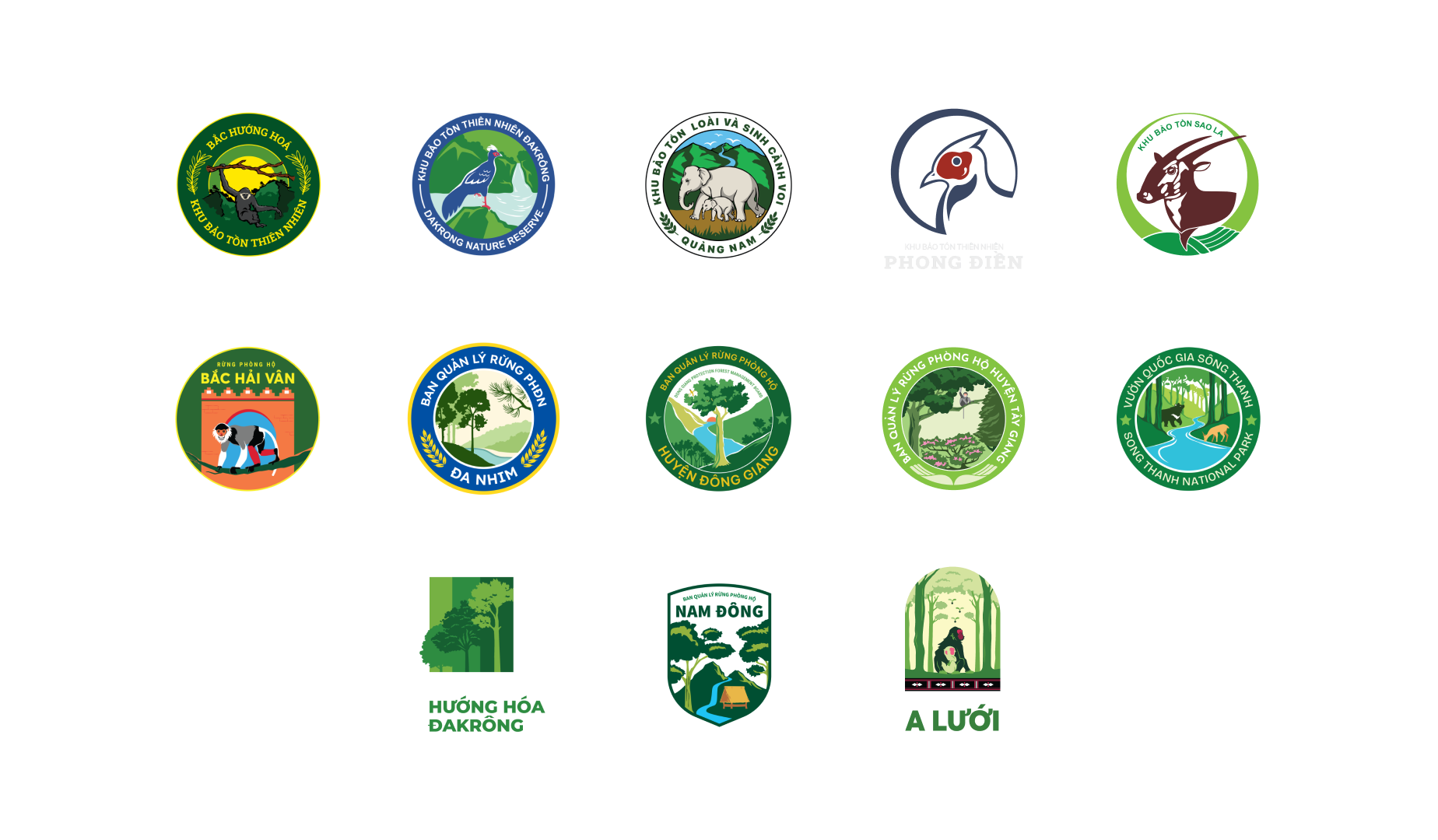
To date, 17 protected areas have embraced their unique identities, marking a significant stride in safeguarding our natural heritage. This journey is far from complete, as we strive to illuminate every corner of Vietnam's wild heart.
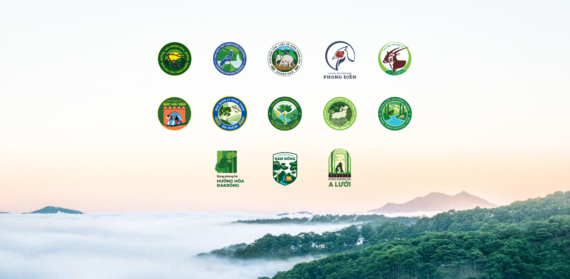
Each species of tree, each element of the ecosystem and the people attached to that have their own story. RIO has condensed and symbolized the spirit of each lesser-known forest, creating unique visual identities that capture the essence of these natural wonders.
x Accurate, Comprehensive, Aesthetic
Rather than pursuing superficial aesthetics, this project is rooted in functional design. Our focus was on creating logos that effectively communicate the forest's identity while respecting the constraints of the field. By combining simplicity with creativity, the output produced by RIO is simple, easy to understand, easy to implement, easy to spread while remaining true to the ecological characteristics of the area, providing a solid foundation for future communication efforts for the forest rangers.
While meeting these essential requirements, RIO has also refined the design through meticulous attention to details, layout, and color choices, culminating in a logo that is both aesthetically pleasing and conceptually sound.
x The Language of Conservation
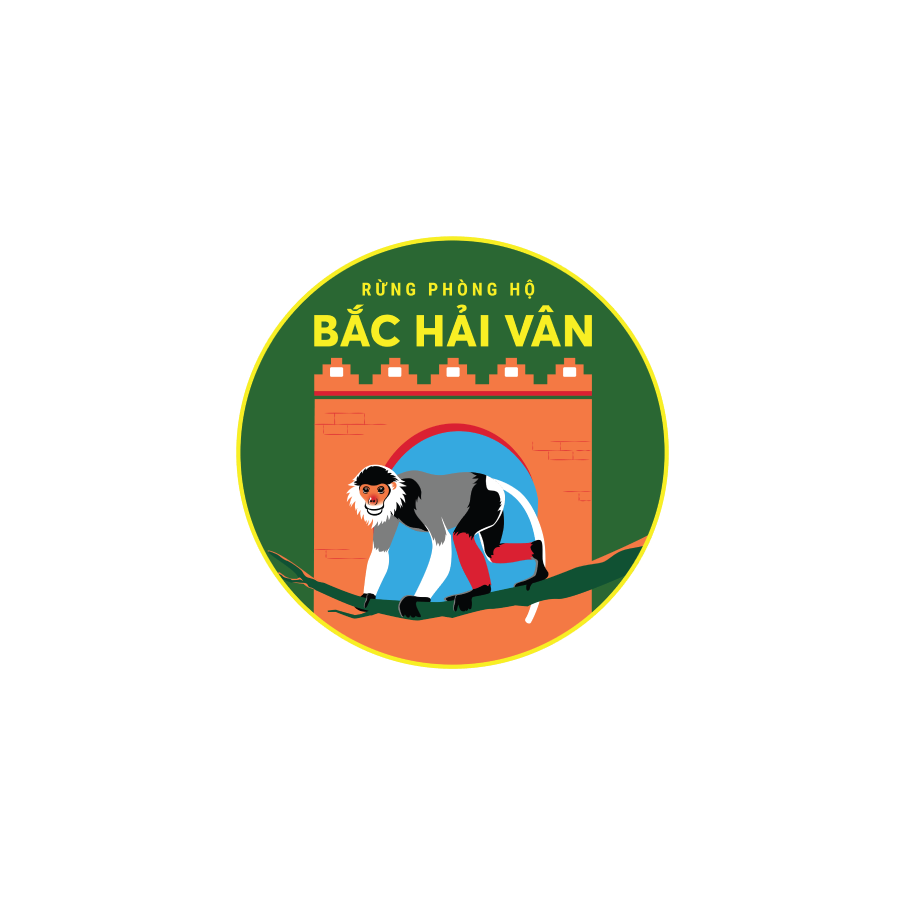
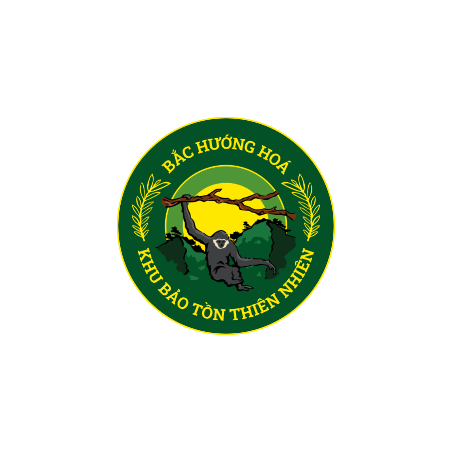
Each logo is a unique tapestry, woven from the distinct threads of its forest. From the majesty of ancient trees to the fragility of endangered species, the logos encapsulate the forest's essence. Each line, detail, and color within the logo narrates a story of conservation, reflecting the tireless efforts to safeguard biodiversity and foster sustainability. The logo then comes alive as it embodies the spirit of the forests and their protectors, inspiring a call to action to preserve nature's masterpiece.
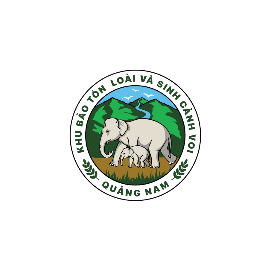
The image of the mother and calf elephant turning back in the logo for the Elephant Conservation Area symbolizes the animals' unwavering return to their sanctuary, a place where they are always loved and cared for by forest rangers.

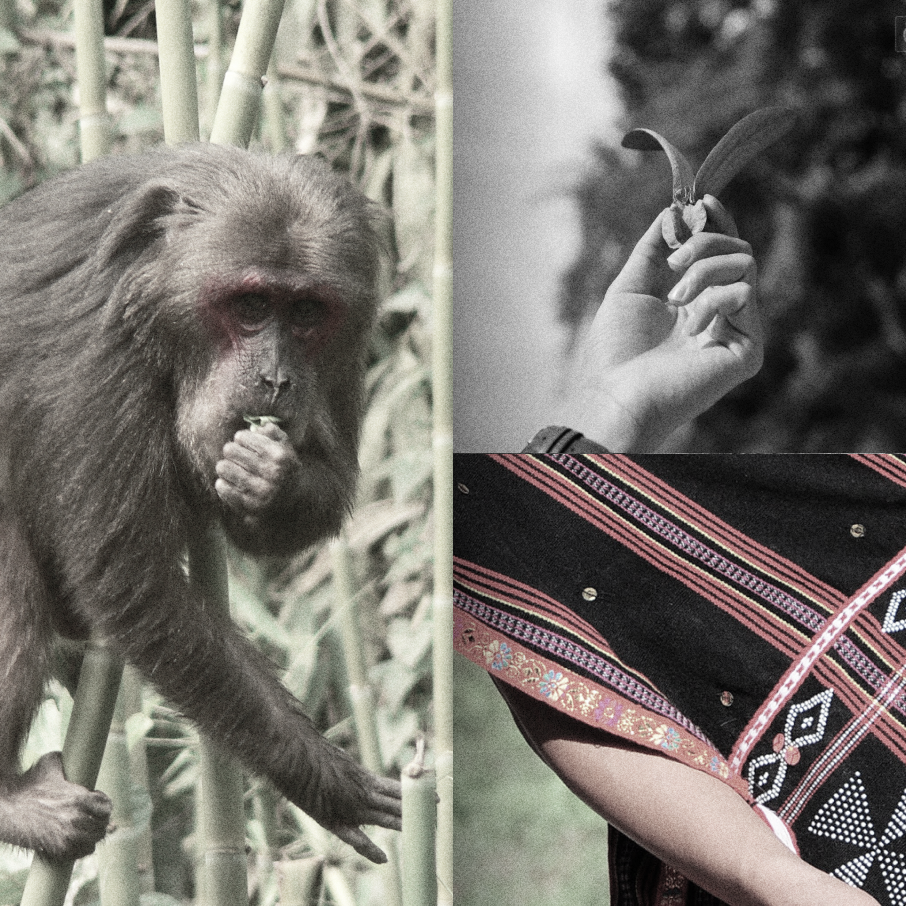
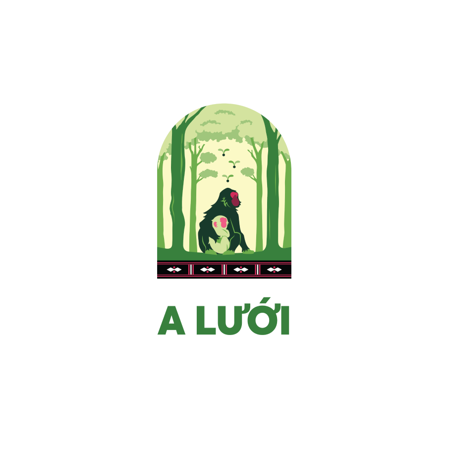
x Mother Monkey embrace her child in A Luoi
The overall design of the A Luoi Protective Forest logo aims to convey a sense of nature, fostering a feeling of protection and care.
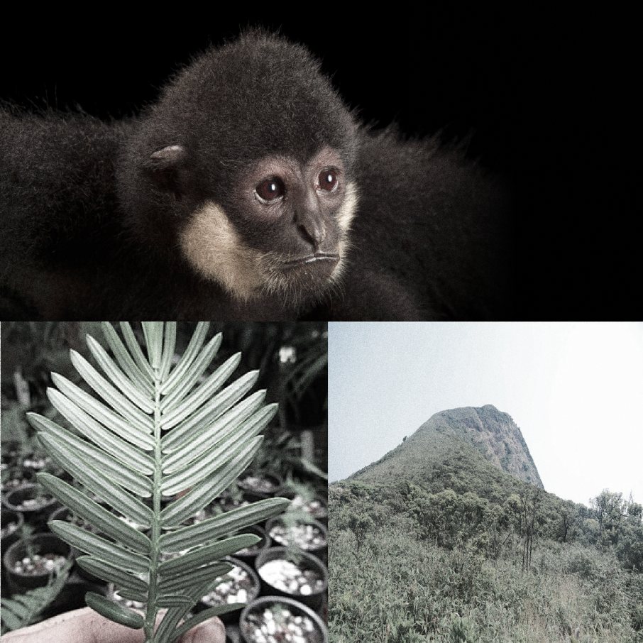
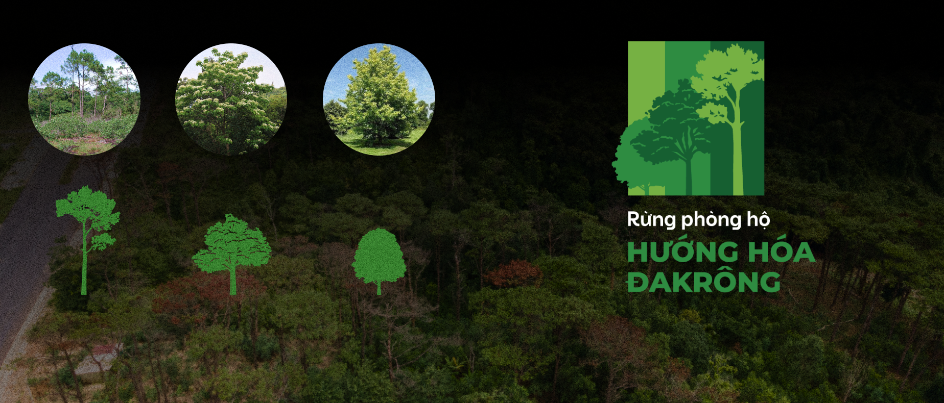
Pine, three-seeded betel tree, and liquidambar formosana are three endemic species found in the Huong Hoa - Dakrong protective forest. Due to the specific topography, the protective forest here is interspersed with forestry land and production land. Therefore, the forest not only plays the role of watershed protection but also meets the livelihood needs of the people, solving the problem of conservation and sustainable livelihood development.
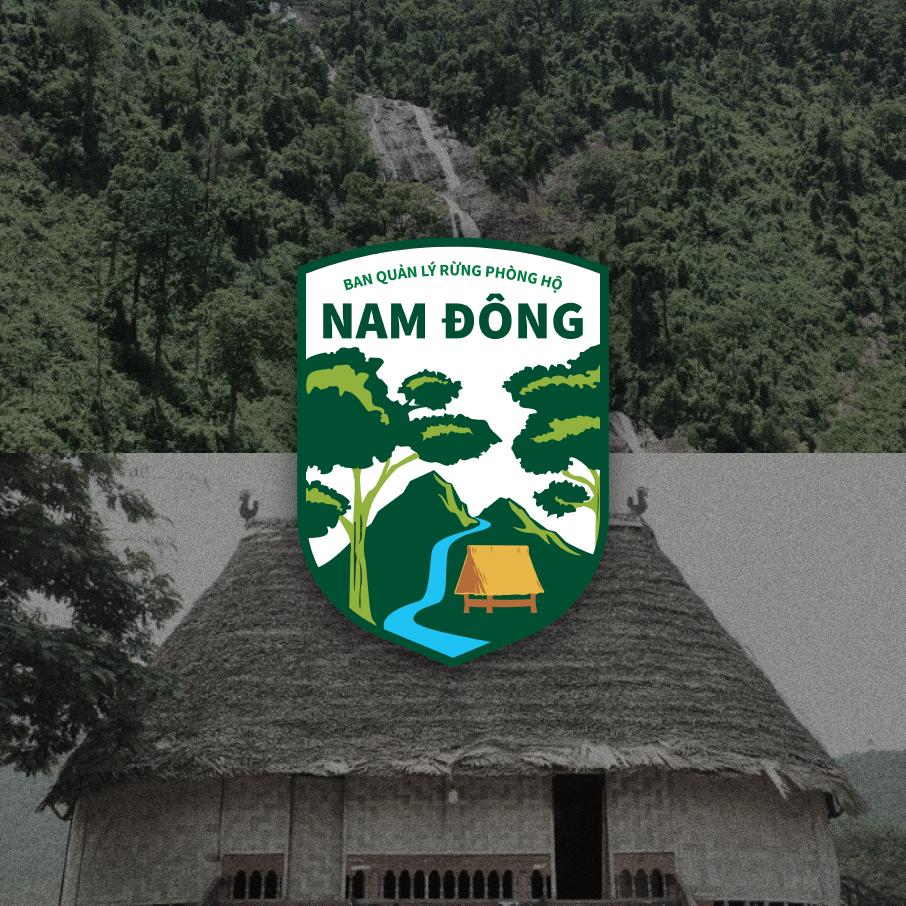
x Humans and Nature in harmony in Nam Dong
The Co Tu people, constituting 43% of Nam Dong's population, have a close-knit relationship with the forest and own a rich, unique culture. Therefore, in the Nam Dong Protective Forest logo, a traditional Co Tu GươI house peacefully coexists with majestic mountains, under the shade of evergreen ironwood trees - a characteristic species of the region.
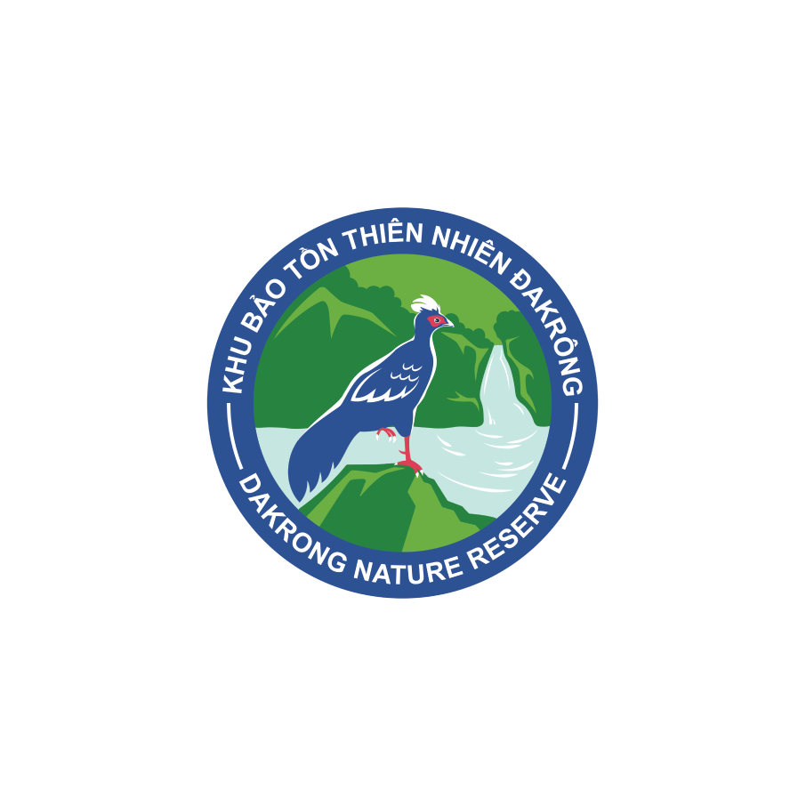
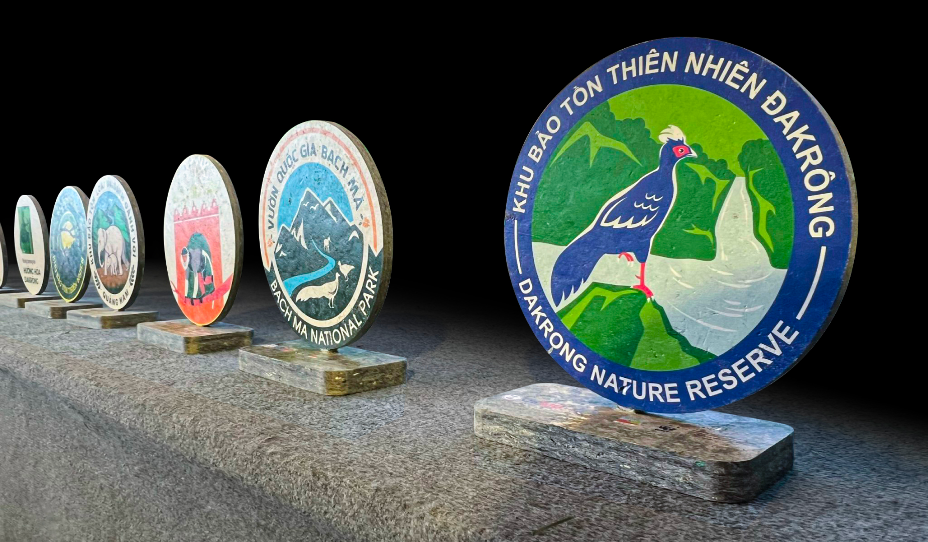
x The natural pride of Dakrong stands out beautifully, majestically, and vibrantly
The white-crested pheasant, elegantly standing on one leg in front of the cascading rhododendron waterfall, embodies the grandeur and beauty.
When the identity image is introduced, the rangers will have powerful visual tools to captivate and influence their audience. This aligns perfectly with their goal in joining this project: to bring the forest to life, to give voice to its creatures, and to make the forest a living presence, far beyond just a name known by few.
