TP Bank
TP Bank's visual campaign collection
Key visual
Advertising
Campaign
Print design
Advertising
Campaign
Print design
HOW TO CREATE MESSAGE THAT REALLY CONNECTED WITH CUSTOMERS
Leading position, The no 1 brand, Class experience: Flowery words are used a lot in the banking industry.
However, if catchy messages don’t point to specific customer interests, show the reason why they should buy the product - the communication between brand and its customers will become loose.

Therefore, from TPBANK’s desire to affirm its leading position, we concretize that position through activities that have been done by the brand itself - “Leading all trends in every experience that customers have in banking”. From that, customers are able to enjoy the service to the fullest.


The persuasiveness of the idea is increased by focusing on the benefits - what customers really care about. And that is where the real connection is made.


TOUCHING THE HEART OF CUSTOMERS FROM DEEPER UNDERSTANDING
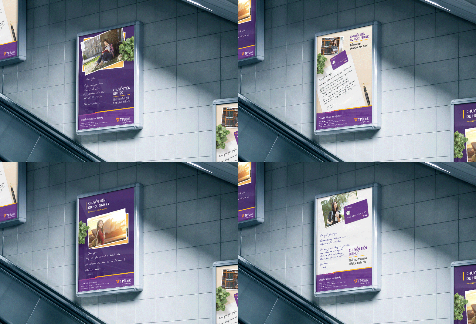
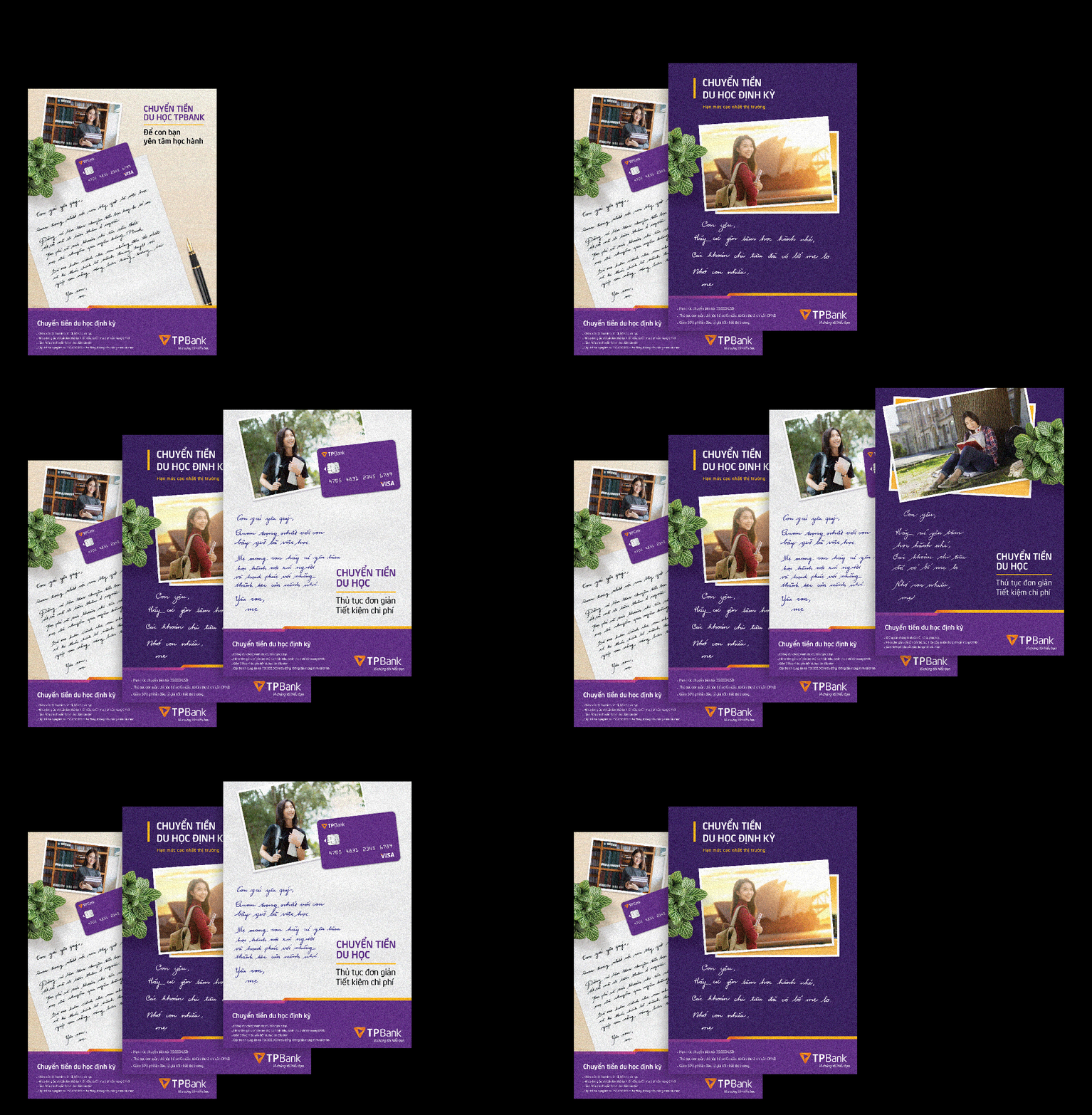
Targeting the need of transferring money to overseas students, TPBANK’s products are not too different from those of other banks.
Therefore, we chose the emotional element to be the direction for the idea - that's also in line with TPBANK’s slogan “ A deeper understanding”.
Therefore, we chose the emotional element to be the direction for the idea - that's also in line with TPBANK’s slogan “ A deeper understanding”.


The Key Visual of a handwritten letter from a mother to her studying-oversea daughter was formed from that. This simple design touches not only the emotion of TPBANK’s brand manager but also the heart of TPBANK’s customers.
WHEN CREATIVE IDEA FILLED IN THE BLANKS FOR ALL THAT IS NEEDED.
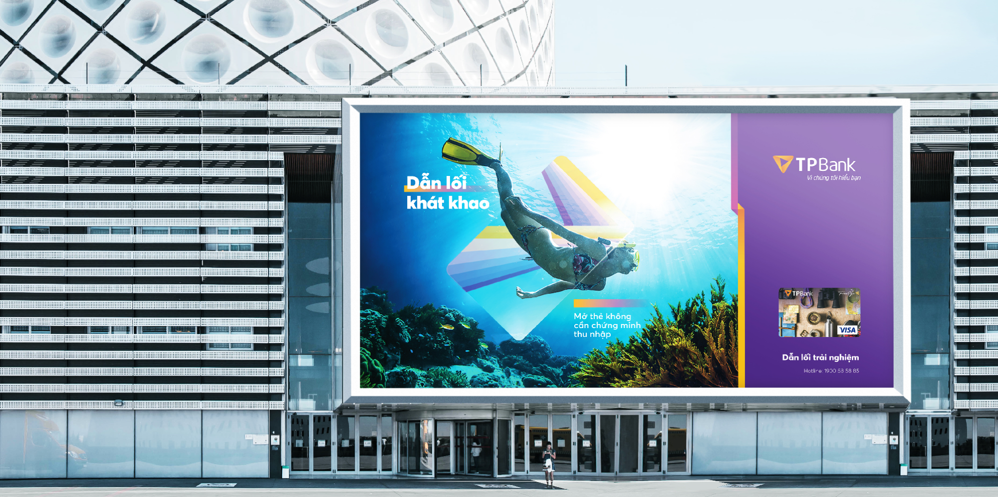
The Free Go TPBANK card is designed specifically for travelers who love to explore new lands.
Young people have plenty aspiration and enthusiasm. But they also lack of finance, experience and spending plans.


From this insight, we come up with the idea of a TPBANK companion - the one that accompany the young desire to “go on” “experience” and “discover”. This also the one that fill in the blank that what young people are missing - finance, experience, plans.
Choose beautiful images, use bold text to bold clear and intelligent messages. We were leisurely in the design because the creative idea filled in all that was needed.
need more creative key visuals?
